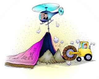
It departs from the conventional concept of an airport where the priority is convenience and comfort of passengers from the point of entering the airport, checking in and clearing security and immigration, and boarding the plane by the shortest possible route.'
'But the KLIA 2 designers had a different concept in mind. They tried to combine a mall, a street thoroughfare and an airport all in one. As a result, the basic function of an airport, that is to get passengers to the departure gate with the least hassle, was compromised.
Spatial utilisation to accommodate the other two functions caused further confusion, as the passengers have to go through a maze to check in and to negotiate alleys and corridors to get to the departure gates.
Signages are small and in subdued colours. They have to compete with the large bright neon advertising lights of the retail outlets and the eateries. As a result, first-time and even returning passengers find great difficulty in getting proper directions.
Arriving passengers have to negotiate three tiers of ramps from the aerobridge to the concourse.
Then they have to walk some distance before climbing up and down escalators and jostle through corridors before finding the immigration and Customs clearance checkpoints.
After that, another long walk to the baggage claim area where mayhem reigns as passengers and their trolleys wait to claim their bags at the congested space between the carousels.
Passengers have to endure a long wait before retrieving their luggage and then another walk through the shopping area to the pick-up area. There seems to be a systemic failure in guiding the passengers from disembarking to the pick-up point.'
More:
http://www.thestar.com.my/Opinion/Letters/2014/12/20/Poor-thought-to-KLIA2-design/


2 comments:
I happen to visit KLIA2 yesterday to send off my maid. I dropped her off at Depature with my wife and park my car at Level 7, Carpark B. It was a 10 minutes walk to the AA check in counter. We check in through the kiosk and dropped her luggage. It was a breeze with a short wait at the luggage check in counter. Then we went for lunch. We were spoilt for choice. You named it and they have it. KLIA2 looks more a shopping complex rather than a airport. Well it makes it more pleasant to send off someone or wait for an arrival. Yes, one feels lost in the place but there are plenty of guards to direct you. You even have a supermarket and convenience store. I saw passengers buying loads of cream buns. Probably they will be hungry on the flight home. Overall this is a more exciting airport than KLIA. In comparision KLIA looks dull and uninteresting. The check in counter area is small as passengers would have check in online and without luggage. But I have yet to venture into the departure zone. I feel that KLIA2 is more vibrant and make waiting more enjoyable, instead of waitng at the nearby gas station. But parking is a killjoy. I paid RM 8 for 2 hours of parking. The verdict? I was pleasantly suprised by KLIA2. Budget travellers getting a better deal than full service travellers.
memang teruk KLIA 2.especially for old folks like me and friends. semuanya jauh.teruk betul.buggy ada nmpak tapi bila tanya no driver pulak.trpaksa la jalan kaki.penat giler.mcm nk taubat tak mau pergi dah.tapi apa boleh buat kita bukan org kaya..kan.terpaksa la..
Post a Comment